WALL & WRENN
Wall & Wrenn is a clothing startup that creates everyday staples founded on comfort, versatility, and craft. This brand standards manual will act as a guide to creating a consistent identity that appeals to Wall & Wrenn's target market of professional millennial men who value looking and feeling their best.
Challenge
The goal was to create a consistent identity that appeals to the target market of professional millennial men who value looking and feeling their best.
Solution
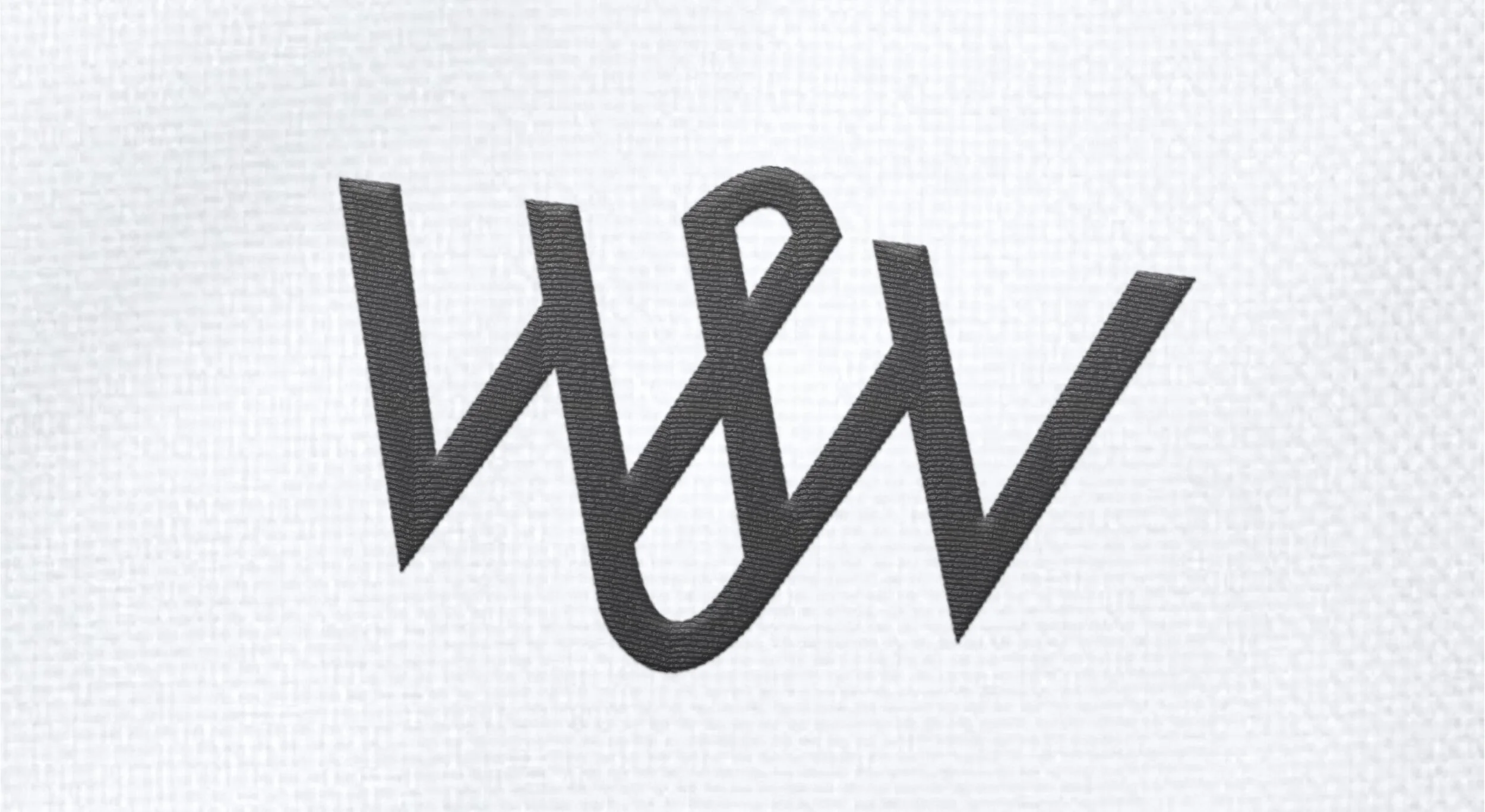
The lettermark shows the subtle intertwining and overlapping of two Ws and an ampersand. Not only does this serve as a monogram but is an abstract representation of the intricate knit of the signature shirt fabric that that makes the brand so special. This practicum team successfully crafted a brand identity for the start up clothing company Wall & Wrenn. They created everything from the logo design, printed shirt labels, packaging, website prototype, brand guidelines, social media guidelines, and assisting the client in brand positioning and messaging.
Design Team Sierra Stamm, Paula Katris, Trunoe Perry
Final Logo Embroidered


Logo on White and Navy


Market Research


Wall & Wrenn Website


