THEATRE DEPARTMENT
MAINSTAGE
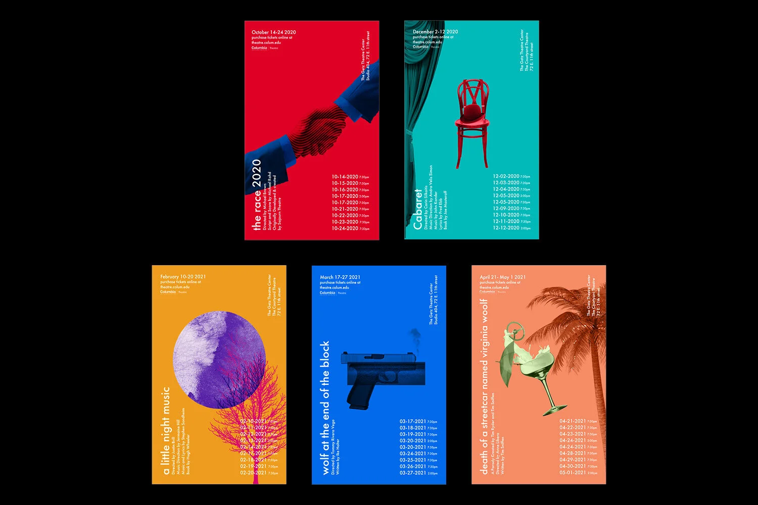
Columbia College Chicago’s Mainstage is the Theatre department’s opportunity to share student and faculty work with the community and college. The 2020-21 season consists of five plays, described by our client, as 'a season with a bite.'
challenge
A collaboration between Theatre and Design, the goal of the project was to create a season campaign that is fresh, bold, and daring, and would catch attention on and off campus. One of the criteria that the design team developed early on in the process was that we needed the campaign to be tightly tied together as a whole. We wanted the Columbia community and others to recognize the design from the first play of the season to the last, thus calling for a cohesive design system. We also wanted to explore a mark for Mainstage to set it apart as an individual entity housed under the Theater department, yet keeping it on brand with Columbia’s identity. In initial meetings with the clients, we came to the conclusion that they weren’t utilizing social media to their advantage, and set out to incorporate a social media tie in with the physical posters, postcards, and playbills.
solution
In their research, the design team watched clips and read scripts of every play in the season lineup. We also visited the Theatre department, its Costume shop, and stages. We came up with three concepts to present to the client. The first was a photography concept, where we planned to choose wardrobe from their vast collection, and use current Theatre students as models. These were to be dramatically lit studio shots in black and white, collaborating with a Columbia Photography Senior. The second concept was a graphic illustrative collage concept, where objects were layered and positioned in various compositions with highly texturized surfaces in a distinctly bright color palette. Lastly, a concept consisting of exclusively typography using the typeface, Officina (Erik Spiekermann) was presented. After almost fully fleshing out the designs, particularly the Illustration and the Typography concept, the client chose Typography. They felt this best embodied the energy and point of view of this season’s lineup.
Design Team Jessica Oh, Emma Carrillo, Anthony Camacho


Research and Exploration

Poster Photography Concept
Poster Illustration Concept
Poster Typography Concept

Mainstage Logo Concepts

Mainstage Logo and Columbia Lock-Up


Final designs, Typography Concept, include: Posters, Playbills, Social Media Promotion, Postcards, and Composite Lobby Marquee


